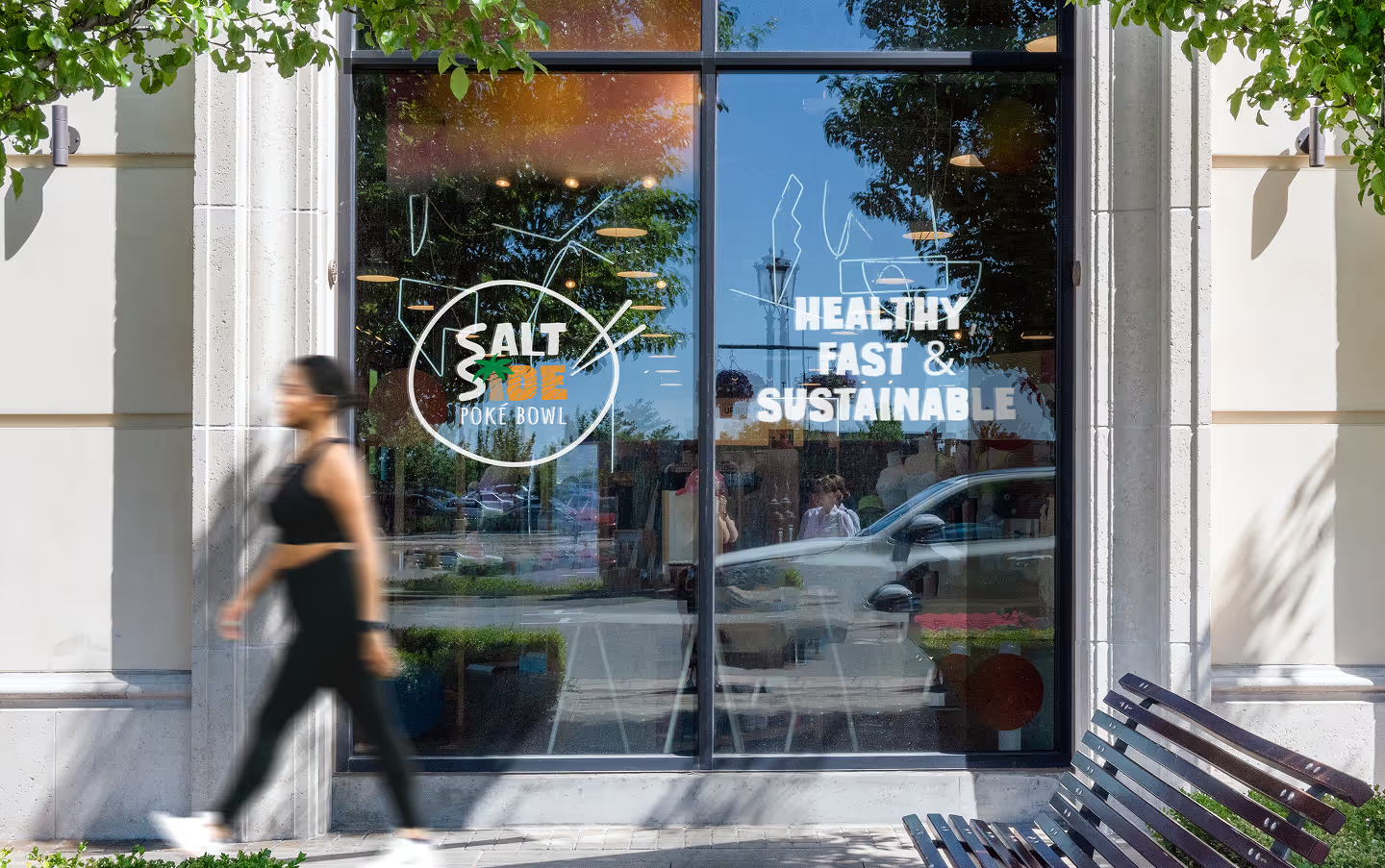
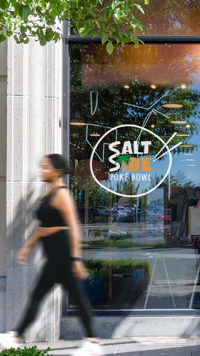
Saltside is a local pokébowl restaurant that wanted to refresh its brand identity. Their previous look had become outdated — it no longer captured the energy, color, and freshness that define the brand. The goal was to design a visual identity that felt as vibrant and dynamic as the food itself: healthy, fast, and sustainable.
The challenge was to express Saltside’s story through visuals — something that reflected the freshness of the sea, the rhythm of surf culture, and the simplicity of clean eating. The old identity felt static and dull. We needed a brand that moved — literally and emotionally — with playful forms, natural flow, and energetic colors.


Fresh, fast, and full of flavor — where coastal energy meets sustainable design.
At the core of the new identity is a logo shaped by connection and movement.
Two interlocking S-forms form a stylized wave — a symbol of flow, energy, and balance.
Each curve represents both the rhythm of the sea and the playful energy of surf culture.
Typography complements that motion: bold yet fluid, casual yet refined. The palm tree detail
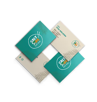
At the core of the new identity is a logo shaped by connection and movement.
Two interlocking S-forms form a stylized wave — a symbol of flow, energy, and balance.
Each curve represents both the rhythm of the sea and the playful energy of surf culture.
Typography complements that motion: bold yet fluid, casual yet refined. The palm tree detail that forms the “i” adds warmth and a relaxed Mediterranean touch —
a subtle nod to sunshine, sea breeze, and laid-back summer days.
Colors that taste like summer
The color palette was inspired by fresh ingredients and natural tones. Bold orange with soft white stripes recalls the texture of salmon — connecting design directly to the dishes. Beige and warm neutrals balance everything out, evoking calm, care, and authenticity. Together, these tones create a look that’s bold yet grounded — modern but organic.
The color palette was inspired by fresh ingredients and natural tones. Bold orange with soft white stripes recalls the texture of salmon — connecting design directly to the dishes. Deep purple adds modernity and contrast, hinting at creativity and flavor depth. Beige and warm neutrals balance everything out, evoking calm, care, and authenticity. Together, these tones create a look that’s bold yet grounded — modern but organic.
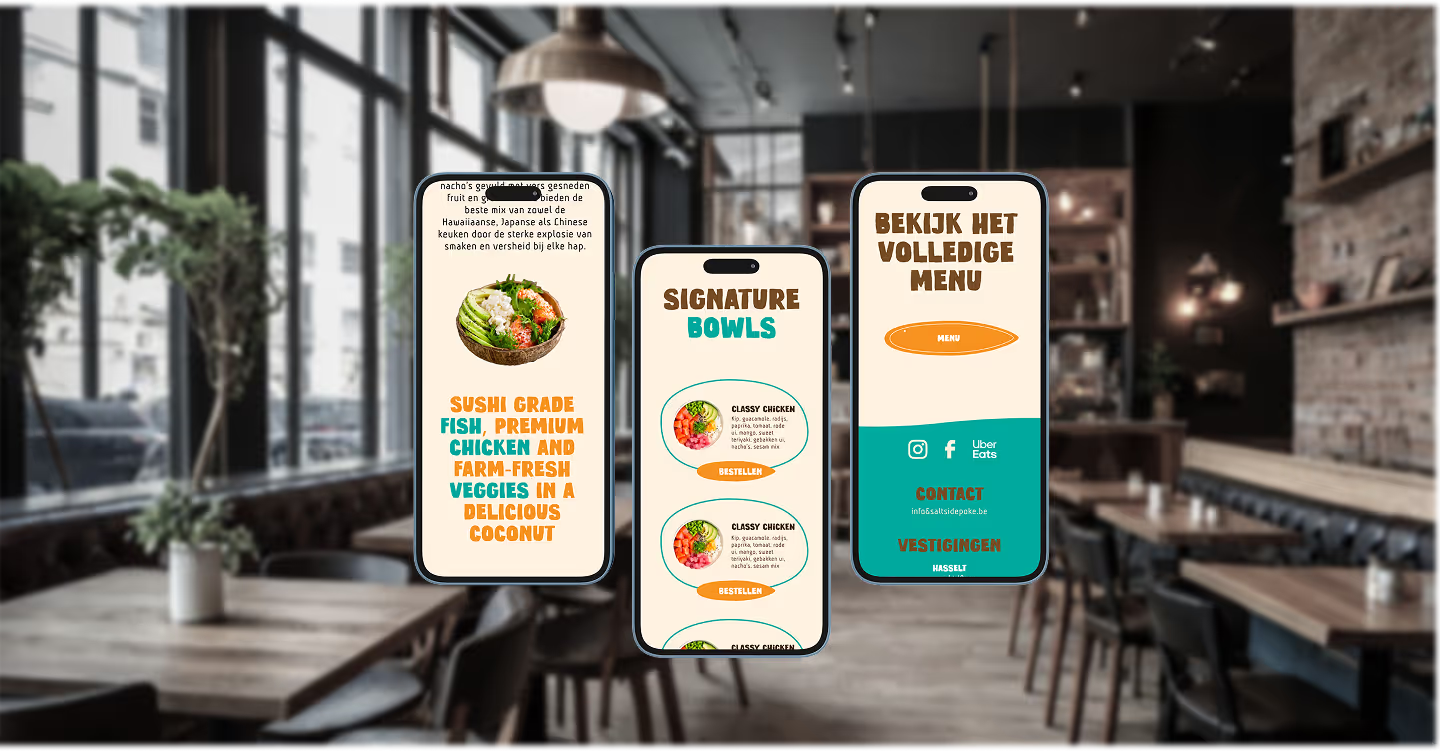

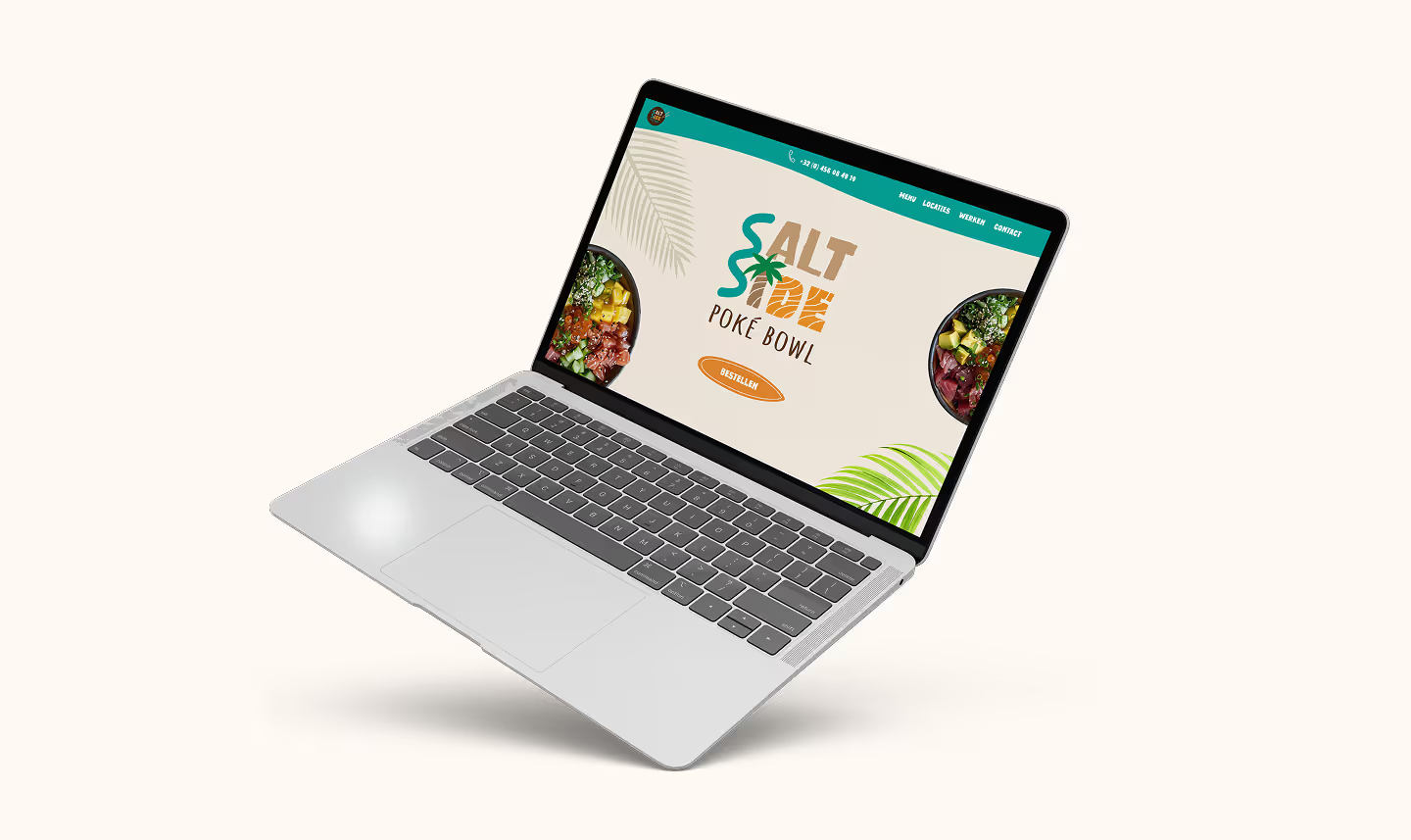
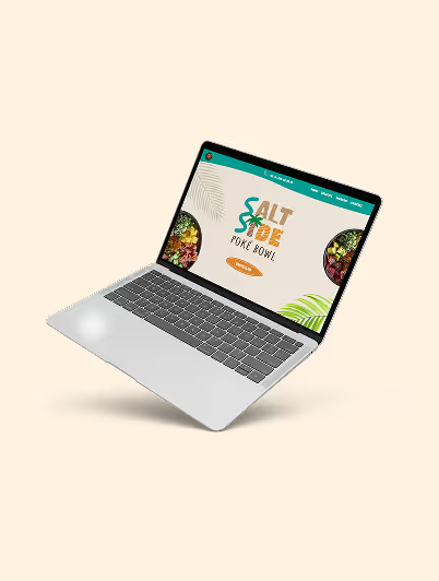
From website visuals to business cards, Saltside’s identity now flows consistently across every platform.
The brand speaks through texture, tone, and motion — expressing freshness not just through food, but through feeling. The result? A cohesive, modern identity that invites customers in before they even see the menu.
Saltside now stands as a vibrant, memorable brand that tastes as good as it looks.

to some of the most common questions about my work, process, and approach.
No long reads — just clear insights to help you understand how I design, create, and collaborate.
I mainly work on web design, UX/UI, graphic design, and social content. Whether it’s a full rebrand, a new website, or designing branded visuals, I make sure every project strengthens the brand and adds real value.
I follow my 4-step approach: What, Why, How, When. This keeps every project structured and clear. We start by defining the goals, dig into the purpose, shape the strategy and planning, and then deliver step by step.
It depends on the scope. Smaller projects like a logo or business cards can take a few weeks. Larger projects such as a full website or rebrand usually take a few months. I always set clear deadlines and milestones upfront.
Absolutely! I love helping emerging brands and small businesses grow with fresh, scalable design solutions that fit their budget and goals.
I test and optimize using methods like usability testing and A/B testing. That way, design choices aren’t just visually appealing — they’re also proven to be effective.
Yes! I create branded visuals and templates that make your social channels look consistent and professional. While I don’t always handle ongoing management, I’ll deliver everything you need to keep your feeds looking fresh.I test and optimize using methods like usability testing and A/B testing. That way, design choices aren’t just visually appealing — they’re also proven to be effective.
%20Medium.avif)
Open
%402x%20(1).svg)